

Makeup and movie tie-ins are big business these days and when it works, it works well. Urban Decay partnered up with Disney for the first Alice in Wonderland film a few years back, creating a sell out Book of Shadows eye palette and this year it's full steam ahead again with Alice Through the Looking Glass.
In this year's collection, there's a "sequel" to the Book of Shadows (find out more about it here) as well as five limited edition lipsticks (€19.50), which I've been testing out.
Encased in kaleidoscope packaging, all the lip shades have been inspired by characters from the film, which goes quite a way towards explaining why Urban Decay would launch shades like blue, berry and purple during the summer months. So before going into what they actually look like, here's what they are and who inspired them.
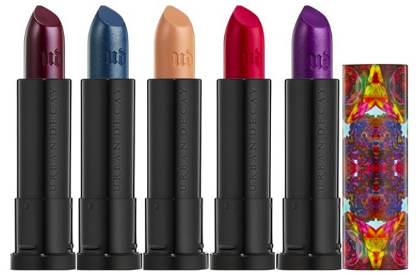
- Mad Hatter: Aside from Alice, he's the most well-known character from the world of Alice in Wonderland and this metallic, bright purple lipstick captures his personality perfectly.
- Time: Time is part human, part clock - the deep, metallic blue with a hint of gunmetal grey plays homage to this peculiar character.
- Alice: The titular character with hidden depths, the lipstick shade is sheer nude with a pink shift that glimmers in the light.
- Iracebeth: A beautiful bright, matte red that encapsules the Red Queen.
- Mirana: Mirana is also known as the White Queen, whose signature look comes complete with a dark, berry lip.
Advertised
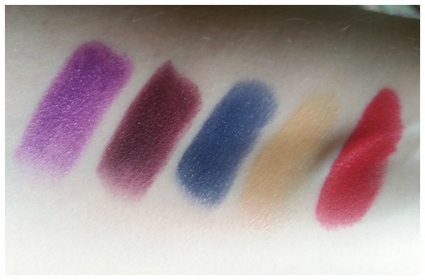
In terms of quality, you know you're in good hands with Urban Decay, especially when it comes to the matte shades which are particularly vibrant. Here you can see swatches from L - R of: Mad Hatter, Mirana, Time, Alice and Iracebath - but the proof is always in the wearing, isn't it? It's always interesting for me to see what a lipstick look like on, compared to just swatched - particularly metallic formulas.
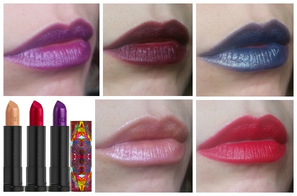
I have to admit I was surprised at how wearable the shades turned out to be. Alice (sheer nude) looked so different when I put it on compared to the swatch that I was blown away; gone was the honey tone and instead it looked more pink, giving a very pretty finish I wasn't expecting. Similarly, Minara (deep berry) looked almost black in the tube but when on gave a really rich colour that I really loved.
Advertised
Mad Hatter (metallic purple) and Time (the metallic blue) aren't really my cup of tea, but for those who like to be a little adventurous they'll no doubt be fun to play with. Iracebeth is quite simply a beautiful red that you can't go wrong with.
Do any of these tempt you?

